
They help Camera Guys with Best Accessories.We helped ” Camera guys ” with their branding
When Camera Guys, a camera accessories startup, needed a total branding solution, we were their first choice. We chose the brand name “Camera Guys” and crafted a meaningful logo for them. Curious how we did it? Read along.
Our Camera Guys Logo Design & Branding Project Process
Creating a unique and impactful logo involves a thoughtfully structured process that aligns with your brand’s identity and resonates with your audience. At IdeaFox, our logo design journey follows these essential steps:
Discovery
Every great design starts with understanding. We begin by gathering insights about your industry, market trends, and customer base. This involves creating customer personas that capture key details, including demographics, preferences, and even their pain points.
Research
Armed with the data from the discovery phase, we dive deeper into competitive analysis and brand positioning. This helps us understand where your brand fits and what will make it stand out. Our research ensures your logo is rooted in strategy, not just aesthetics.
Conceptualization
This is where ideas begin to take shape. We collaborate with you to understand your values, mission, and vision for the brand. Using this foundation, we brainstorm and sketch initial concepts, combining creativity with functionality to align with your brand’s identity.
Design Development
We bring the concepts to life. From typography to color palettes and iconography, we refine the details to ensure the logo is versatile, timeless, and meaningful. Every element is designed to resonate with your target audience and support your brand message.
Review and Feedback
Collaboration is key. We present the initial designs and gather your feedback. This step is all about refining the logo to meet your expectations while staying true to the strategy and purpose we’ve developed together.
Finalization
After incorporating your feedback, we polish the design to perfection. The final logo is delivered in multiple formats and variations, ensuring it’s ready for all applications—from digital platforms to print materials. Your brand’s new identity is now ready to shine
They help Camera Guys with Best Accessories.We helped ” Camera guys ” with their branding
When Camera Guys, a camera accessories startup, needed a total branding solution, we were their first choice. We chose the brand name “Camera Guys” and crafted a meaningful logo for them. Curious how we did it? Read along
Initial Approach
As usual, we started with some background research on their market and the current customer base. Then we created a few customer personas based on the data we gathered. The personas included everything related to each customer type, from their age to their pain points (yes, we had to predict them).
Logo Type Selection
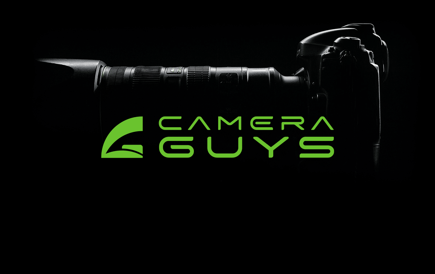
We chose a combination mark for the logo type. What is a combination mark, you may ask? It’s when a brand mark icon and a wordmark are used together in a single logo. Why did we go with this? There are many reasons. First, this brand is a startup, so we needed to register the icon, name, and other brand elements in the minds of people who had never even heard of this brand. Secondly, it’s about the placements of the brand identity elements—on their website, as favicons, in social media posts, and even printed on camera straps, boxes, and apparel. With a combination mark, we can dynamically use the logo by breaking it down into a wordmark and a brand mark whenever needed.
Meaning Behind the Logo
Logo projects from IdeaFox are popular for their meaning. So, what’s the meaning here? The brand mark represents the index and middle fingers in the action of pressing a shutter button, as well as the shutter button itself. Secondly, the curved shape resembles the letter “C”, standing for “Camera.” And when you look at the brand mark as a whole, it also forms the letter “G”, representing “Guys.”
Colour Selection
We chose the mono color “Light Green” as the base for the brand. Green signals the brain with trustworthiness and reliability. We used light green to give the brand an e-commerce vibe. (We had to dodge orange—it’s saturated in the market. We needed this brand to stand out from the crowd.)